Production Notes
I hate hard puzzles and magic tricks, but enjoy them once I
know how they work — so I'm doing something new here and explaining
how I made this.
Also, maybe explaining how it works to you will make the poem even more interactive in a way.
A.
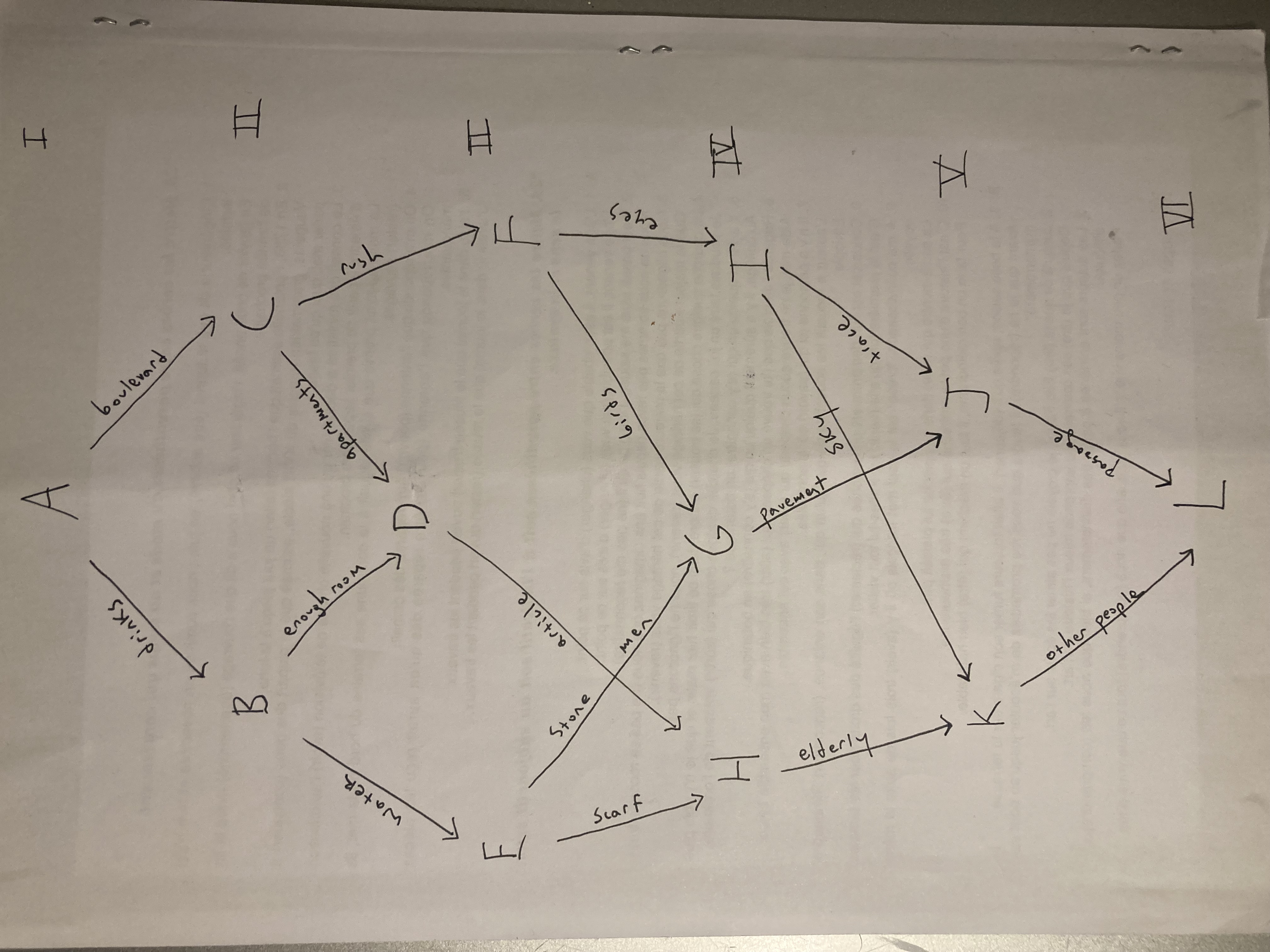
Here’s the 2-D diagram of how the parts of the poem are connected. Each letter
is a piece and each line is a link:

B.
The way it’s structured, choices narrow the further in you go: the first layer
has one piece (A) with two link choices. The second has two pieces (B and C) also
with two choices each. The third has two pieces (F and E) with two choices, and
one piece (D) with one choice. The fourth layer has two pieces (H and G)
with one choice, and one piece (I) with two choices. The fifth layer has two pieces
(K and J) each with one choice, so at the end you really have no options.
I wanted to create a closed loop which begins in one place (A) and, though the
path may vary, always ends in one other (L). This structure is simpler than what
I've done in the past, and could have been coded in a software like Twine.
The code tool kit which my lovely brilliant collaborator Jacob Hall created for
our more complex wordways, however, works here too.
Structurally, the closest thing I’ve made to this is Two Rivers, Ten Things
which is also a net with a beginning, end, and variable path between the
two. In that one, I’ve ordered it via geography: one end is the Potomac river, the
other end is the Rappahannock river, and the poem discusses Northern Virginia and all the
different "things" that represent it to me. But this one is ordered
by time: A is the beginning, L is the end.
Apartment is similar as well, although that
has three beginnings and three endings, with three paths that wind around each other.
C.
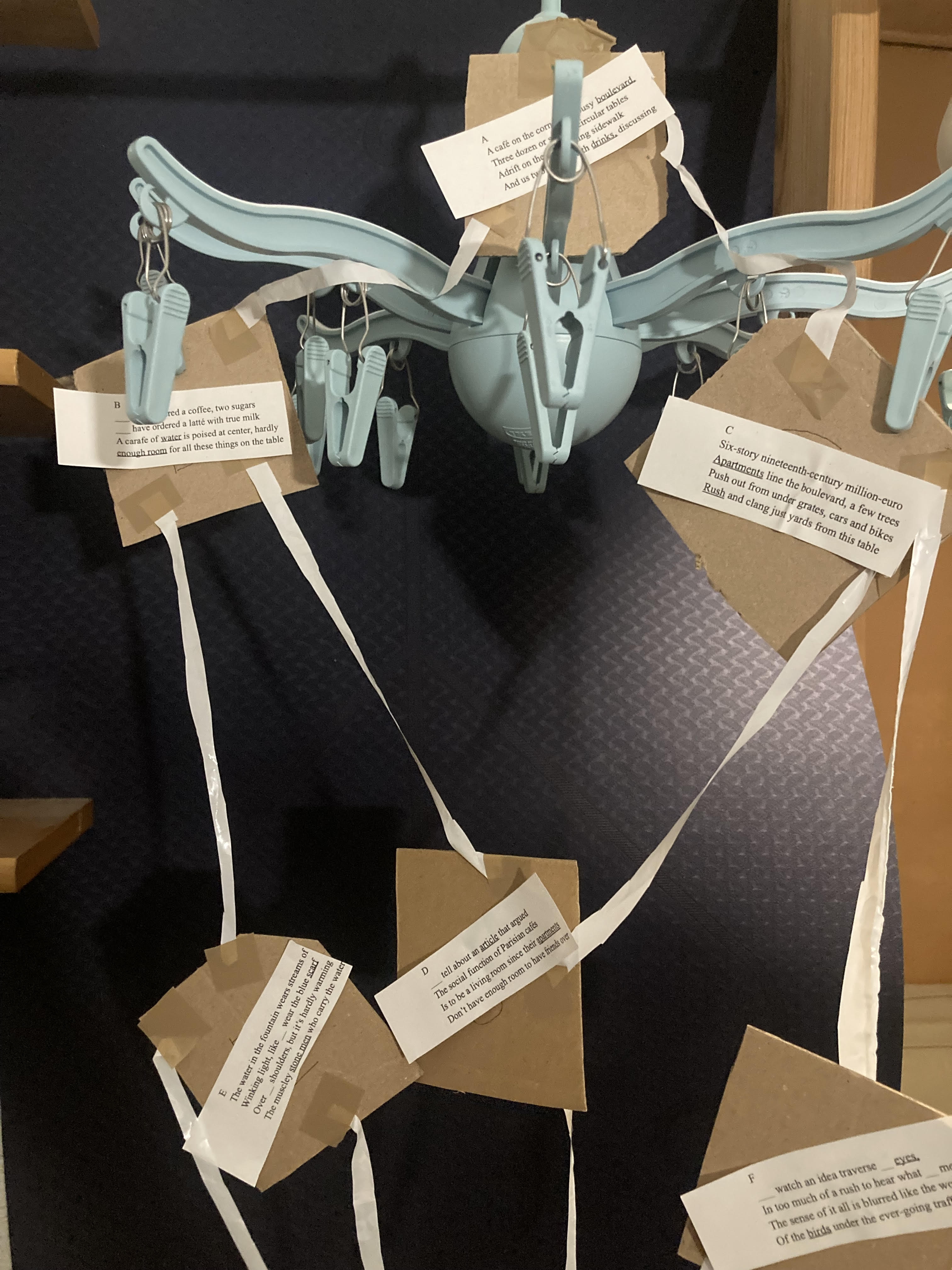
To better visualize it, I made a 3-D model of the poem, part of which you can see below.
My earlier wordways were all structured along 3-D shapes
including a cube, octahedron, and dodecahedorn which were gifted to me in 2018 but
which I have since lost. Geometry gives me a structure to follow for making my
hypertext forms, and while I can't claim to really understand math, it offers
a place to start from and I think all these shapes exist naturally in crystals,
which is cool?

D.
This wordway centers around pronoun drop-down menus, a technique I first started
messing with in 2020, in Tillamook
In all the other wordways I throw up links and ask you to choose between them,
but drop-down menus are different. The drop-down menu offers a more transparent
choice because you know what your options will lead to, unlike a link where
it’s mysterious what will happen next. A drop-down menu is an interactive element
that gives even more control and responsibility to a reader. It also works differently
in time: a link points towards what's next, a drop-down towards what's already there.
At first I thought about putting the drop-downs on nouns, giving the chance for
somebody to change what a poem is about. But then, I thought it would be more
interesting to change the perspectives of a poem, and the most effective way to
do that was pronouns. I was thinking of Bob Dylan’s song Tangled Up In Blue
and how in every live performance he changes the pronouns in the song.
E.
I decided to set the number of possible pronouns in the drop-down menu at two.
In the wordways overall, I present only two to three options at a time. If there's more
options than that, the choice feels less meaningful. I've broken this rule sometimes,
but I feel strongly about it because I think it's what killed the 1990s hypertext
literature I studied closely: these early-internet experimental works sprawl,
overloading a reader with choice, and they are usually not intuitive at all.
I started writing wordways back in 2018 because I read works like Victory Garden
by Stuart Moulthrop or Patchwork Girl by Shelley Jackson (the two major hypertext
novels I like best) and thought, "this is good but the novel isn't the print form
most adaptable to a computer screen." Novels aren't the right use case for
hypertext because most of the reading we do for fun on screens is short-form and
rapid. Further, hypertext mixes up linear narrative, which is kind of what a novel
relies on.
So because poems aren't as centered around narrative and are usually shorter and
more ambiguous than novels, I thought this meant they would play better
with hypertext. I wanted to read a hypertext lyric poem, I didn't want hypertext
sprawl, so I had to write smaller.
F.
But for me, it's always a struggle to do less. I'm naturally pretty extra
as a person, and I’ve been pretty frustrated with my pronoun drop-down menu
wordways in the past because I tried to do too much with them. So I
wanted to write this one like a laboratory experiment, keeping it sterile: a bare-bones
situation where there’s just an I and just a you, open for the reader to fill in.
But there still had to be something for the you and I to do. I often run into this
problem with the wordways where I invent a structure or have a formal idea and
then find no subject to write into it.
G.
Since I live in Paris now, I was thinking of this place and it occurred to me
that having coffee on a busy street with someone, and the way we’re trained to be
oblivious to the urban life around us during that time, was the perfect I-You
laboratory.
I wanted the background to be relatively flat and descriptive: the "poetry" of the
piece has to come from the way the audience selects a pronoun. So I thought of
doing it sort of like stage directions, following how the eye might move across
the scene of a cafe on the corner of a boulevard.
H.
My first draft was in prose, but I felt that was too casual and sloppy. So I switched
to four-line unrhymed stanzas, keeping each line around ten syllables and
loosely iambic, without bothering to end-stop them. This seems to me like the
flattest way to write a poem, and I wanted flatness. Four lines is enough to
elaborate a detail or a turn of mind, but not enough to complete it, I think.
I also chose to keep each quatrain as one sentence, while avoiding dependent
clauses and instead making the sentences grammatically more like lists: the eye
takes in one thing then another, drawing no conclusions and making no subordinations.
I
suppose if you’ve read this far, you’re a friend and interested in my wordways.
So here's why I'm now writing this note.
Café is the fiftieth wordway I have created over the course of four years:
this project has occupied a significant amount of my time and energy, so I need
to account for it somehow. It's clear to me this accounting can't take
the form of deciding whether wordways are good or not, because I can't make up my mind
on that. Sometimes when I look back on this work, I think I've done something
deeply interesting. Other times, I think I've done something deeply embarassing.
But in a way that question doesn't matter at all. Looking at these poems,
I feel the way I do when I look at my own body: it's me, and there's no use
in judging it or worrying how others judge it. The only thing to do is present
it as authentically and fully as possible, caring for it and working with it
as best I can.
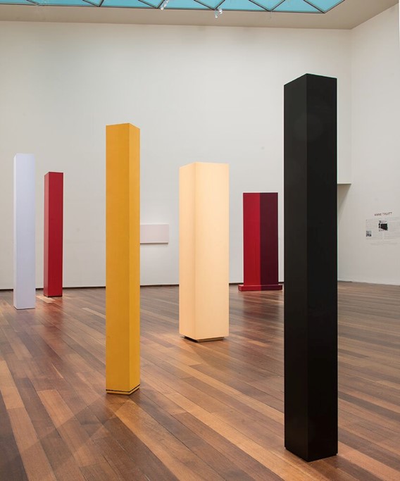
Painter and sculptor Anne Truitt, whom I really fell in love with when I saw
an exhibition of her work at the National Gallery of Art in Washington, created
these sculptures that are painted geometric forms, minimalist and quite beautiful.
I really like them, they inspired the color bars I put around the wordways (which,
in older ones, are vertical like her columns but now are horizontal because it
fits scrolling better).

Somewhere in the exhibition notes, there was a quote from Truitt explaining her
process: “I just felt compelled to make these shapes.” I think that's how it
went, but I lost the brochure I saved from the gallery and can't find the
citation online. Anyways, I really related to that feeling.
I like to think I am trying some version of Truitt's project: grappling
with form and its conditions of arrival (in her case colors and shapes, in mine
the basic tool-kit of HTML and shapes) in order to get at what really are
the foundations of being present in the world. For me, the basis of all art
is conversation: presence embedded in gesture, word, and form. You see her
columns when you walk into the gallery, but they also see you: as I walked
between the sculptures, I remember having the sixth-sense feeling that someone
was looking at me, even though I was there alone.
What I'd most like to do here (for myself, when I re-read these and they occur in
new orders, and for others who might visit them) is create that sense of presence. That's why
interactivity and online text interests me so much.
11/22/2022
